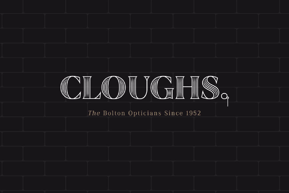
A new visual identity played on old-fashioned service values and the importance of the personal touch.
Client
Cloughs
Year
2019 -
Services
Brand Development
Marketing Literature
Promotional Material
Website Build
Art Direction
Social Media

We shifted emphasis away from the old-fashioned brand and focussed on the long-term values and heritage of the company and its long-standing on the local high street.
The out-of-touch brand threatened the very existence of these long-established opticians.
Jettisoned by younger customers, their existing clientele was ageing. The task was then put to Brand+Code: How to breathe new life into a dying brand?
We shifted emphasis away from the old-fashioned brand and focussed on the long-term values and heritage of the company and its long-standing on the local high street.
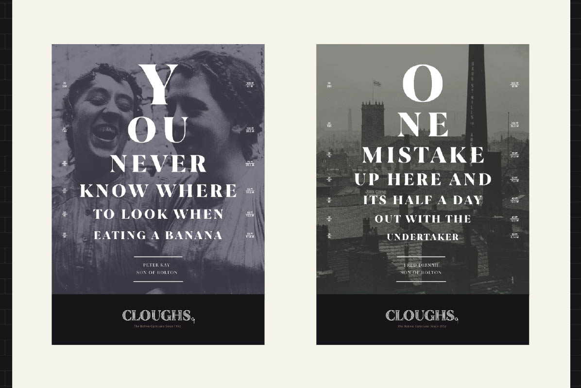
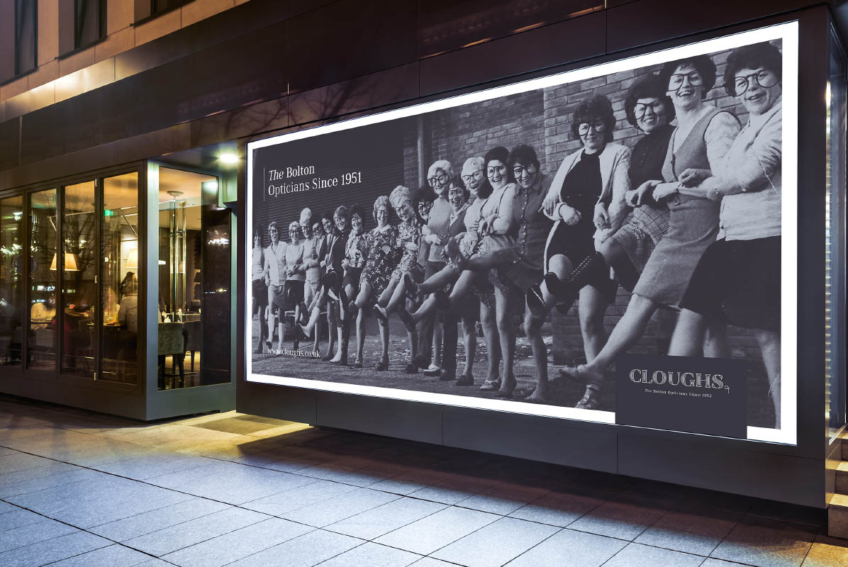
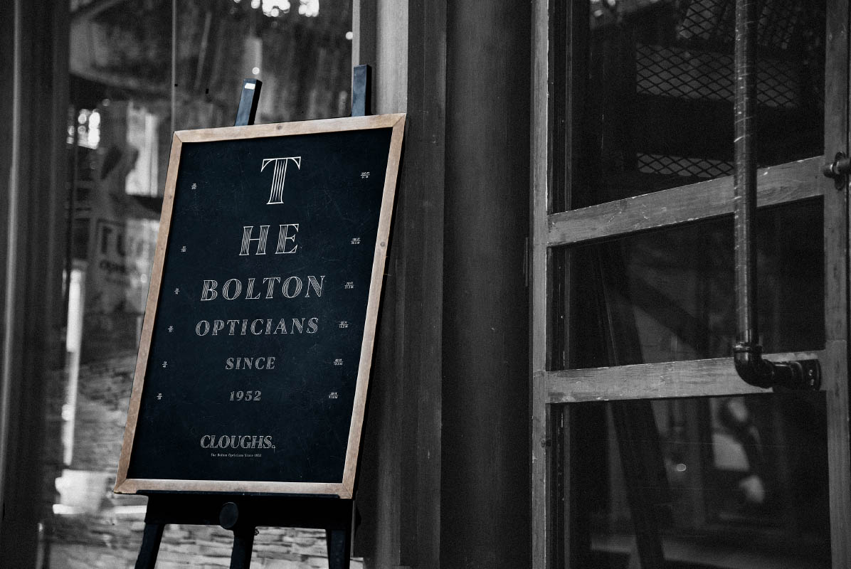
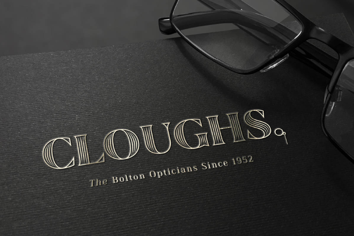
We told the unique story of a brand continuously serving three generations of the local community. A new visual identity played on old-fashioned service values and the importance of the personal touch.
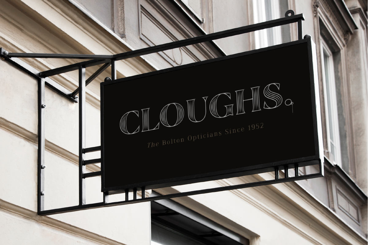
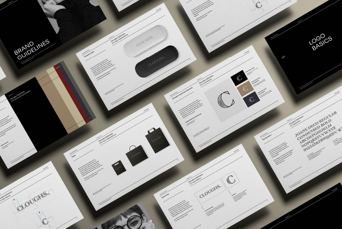
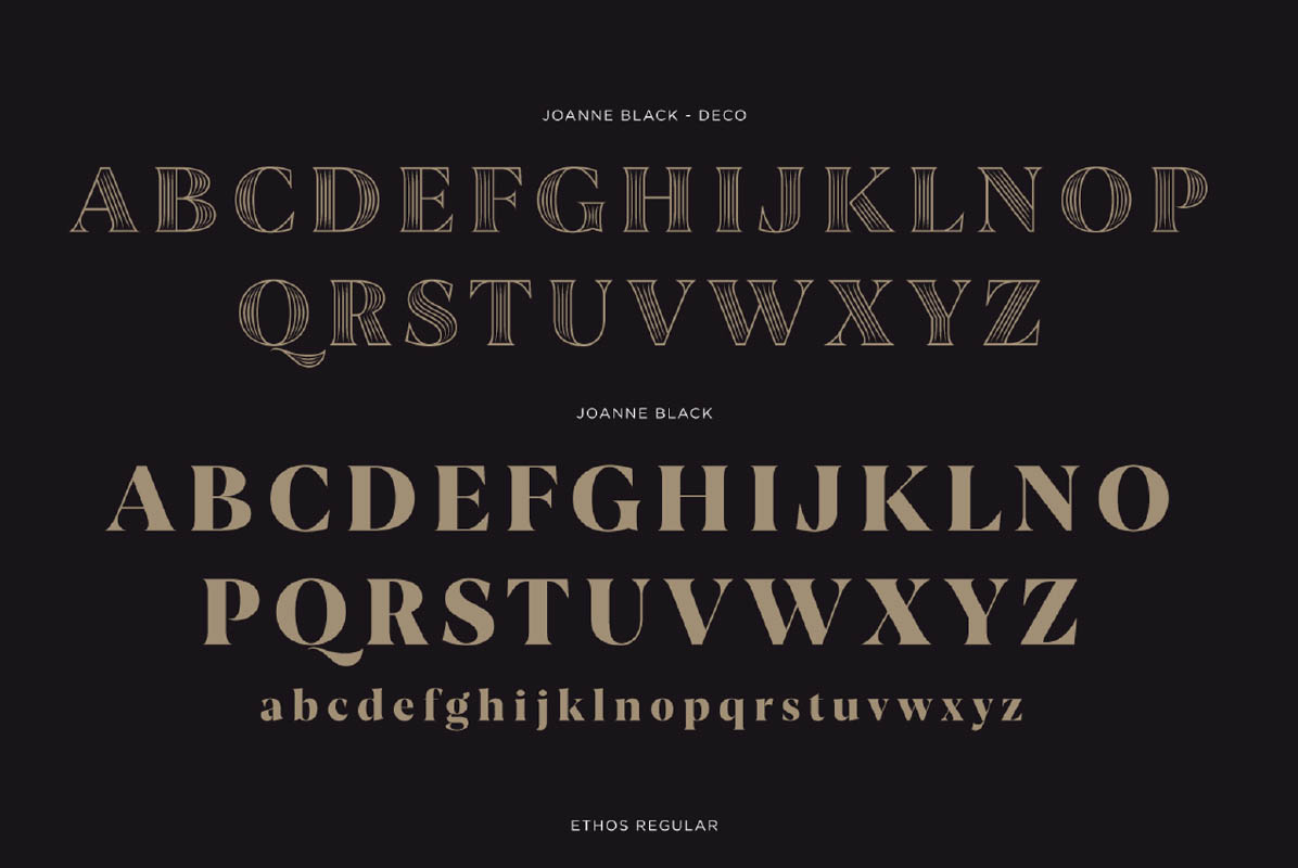
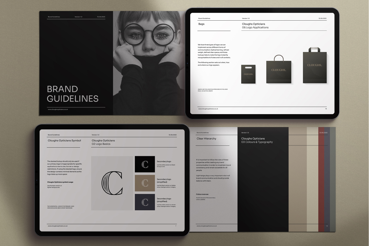
Custom typography that combines sans and serifs was used to combine heritage and modernity. The brand identity is friendly, inviting, and highly detailed, with every element considered and recognisable. We have created unique and playful assets that work cleverly together or apart.
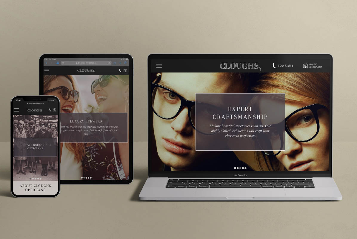
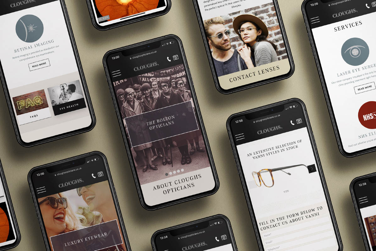
A distinctive high street presence with an accompanying website asked the locals to pause and rethink what they thought they knew about Cloughs.
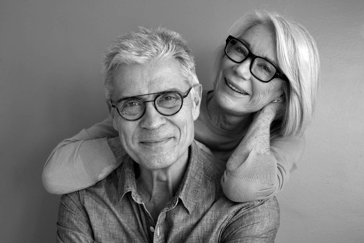
We ensured that the resulting brand accurately reflects what Cloughs do and who they are. Perceptions shifted, and customers returned. The client is now positioned to confidently serve the fourth generation of customers.